

The Best Color Combinations For Acrylic Pouring – No More “Muddy” Pours

Choosing the right colors in acrylic pouring is one of the most essential steps which will determine whether a painting is satisfying and beautiful to look at, or dark and messy.
[TS_Poll id=”1″]
Acrylic pouring is a popular art style, but can be very frustrating for beginner artists.
Artists can feel deflated after their creations turn “muddy” and brown in color, or don’t have the vibrant mix of colors they were aiming for.
[TS_Poll id=”1″]
Sometimes, beginner acrylic pour artists want to give up because they feel like they are wasting paint time and time again and left wondering –
Why don’t my art creations look like the ones I see on Facebook and Instagram?
There are some very simple reasons why, and easy ways that you can improve your pours immediately! Which I will teach you in this article.
With lots of practice and trial and error, I have figured out the reasons why this happens, and the absolute BEST color combinations for acrylic pouring.
Let’s get into it!

Blue and orange work well next to each other like this. But if both mixed together they will make a dull colour.
It’s important to note that, not all colors work when mixed together in fact some colors will mix negatively with others, and I’ll explain to you shortly why that is.
A lot of people overlook this and just throw any colors into a cup. There’s nothing wrong with that if you are having fun experimenting. Playing around with color is an important part of the learning process.
But sometimes after a while it can make you frustrated because you aren’t getting the results you want.
Choice of colors is a crucial step in making a good looking acrylic pour painting.
The colors you choose to pour with, will not only affect how the paint interacts but also determine your amount of cells and the overall outcome of the art piece.
Table of Contents:
- What is a “muddy” mix
- How to avoid a “muddy” mix
- Plan your color mix before starting
- Popular color combos to try
- Color theory in acrylic pouring
- Warm vs. Cool Colors
- The power of Neutral Colors
- Using borders in acrylic pouring
- Color schemes which look great together
- Detecting colors from inspiration
- The best pouring medium to use
What is a “muddy” mix?
A “muddy” mix is when the paint colors which were selected for an acrylic pour combine together and create an unpleasant overall color either in the cup, or in the resulting artwork.
The result of pouring a “muddy” mix of paint is often an artwork which is dominated with dull colors or one that lacks vibrance and contrast.
If your artwork doesn’t look the way you intended and the colors you selected aren’t showing as you expected them to, then they may have combined and reacted in the cup to form a dull mix.
This is a common problem which acrylic pour painters encounter and there are some very simple ways to avoid it.
How to avoid a “muddy” mix in acrylic pouring
The reason why a “muddy” mix happens in acrylic pouring, is because the choice of colors weren’t compatible to mix which other. E.G. red and green paint directly mixed together and made brown!
Some other reasons this may happen is because the artist has stirred together the paints too much in the cup causing them to combine and change hue.
Or when layering the paint into the cup there were no neutral colors selected to help keep bright colors separate from each other.

Pouring strong colors next to each other to do a swipe painting. @canvasincommon
The resulting problem is dull or brown art which lacks contrast, vibrance and definition.
For example, if you were to get a cup, and pour primary colors like red, blue and yellow together, with no additional neutral colors and stir it together. The resulting acrylic pour would come out as a mix of dull brown colors.
Why? It’s more simple thank you think!
It’s because colors opposite one another on the color wheel, cancel each other out if they are mixed together.
The big secret is this, allow these bright colors to be NEXT to one another in a painting because they look great paired next to each other. But DO NOT mix them together.
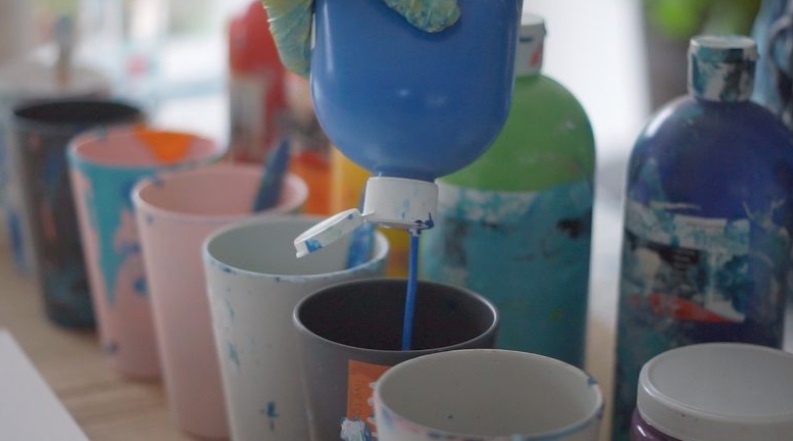
The secret way to achieve this is by layering paint correctly in the cup. You can avoid colors from mixing together by layering some neutral colors the mix too!
For example pretend you want to have red and blue in your pour together, there is a way you can achieve this. Pour in the medium red paint, then pour some white paint, dark red, light pink, silver and/or gold, then layer the blues, dark blue, medium blue, light blue, white and so on.
Your resulting pour will have a range of different hues and be pleasing to look at. The mixes of pinks and red and different blue hues will look great! However if we just put primary red and blue paint in this cup, the end result will not be pleasing.
Another way this works is by mixing bright colors in separate cups, when you pour, pour them next to each other using normal acrylic pouring techniques (example below).
Tilt the canvas so they meet up, but do not mix them in the one cup! So you can avoid that wasted “muddy mix” result.
Pouring a cup with colors layered correctly will create striking, satisfying results to frame in your home.
Here is an example below:

By layering lots of blues in one cup, and gold, cream, grey and white in a separate cup and pouring them separately, a striking color combination is the result
So to recap before we continue on…
The main reason why a bad mix occurs is simply because colors opposite one another on the color wheel have been mixed together in a cup cancelling each other out to form a brown, dull mix.
Unpleasant mixes of paint can also be created because no neutral colors were added to keep them separate.
Plan your color mix before starting
Make a plan of your colors prior to every pour and choose your colors wisely.

Look at inspiration online on platforms like pinterest or look at some of your favourite acrylic pouring artists online, this always helps me with my choices.
Another good way to avoid unpleasant color mixes is by understanding the basics of color theory, we go into this further below. This will help not only in fluid art, but in all areas of visual art design in your life.
Also remember you are NOT alone with these paint mix problems. Learning the right color combinations makes up a totally normal learning process for acrylic pour painters. We have all experienced this!
Popular color combos to try
Before we continue let’s go over some satisfying color combinations you can try at home. I have tried these and been very satisfied by the results!
- Simple and effective: blues (light and dark options), white, cream, yellow (or gold), a little bit of black paint
- Dynamic: white, gold, black, grey or silver
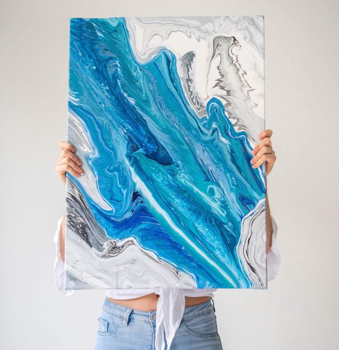
- Sea: turquoise, dark blue, light blue, white, cream for the sand
- Rainbow: red, orange, yellow, green, blue, indigo, violet separated by neutral colors or poured separately
- Flower: red, pink, white, light green, dark green, white, yellow
- Earth and sky: brown, sandy color, dark green, light green, white, dark blue, light blue
- Desert: red, orange, tan, cream, dark brown, peachy pink, white
- Pale colors: peachy colors, pink, light pink, gold, light grey, charcoal grey, white, optional dark blue, light blue
- Forest colors: Deep green, Light green, Pale Brown, Cream, White, Sky blue, mid blue, black, deep brown, gold

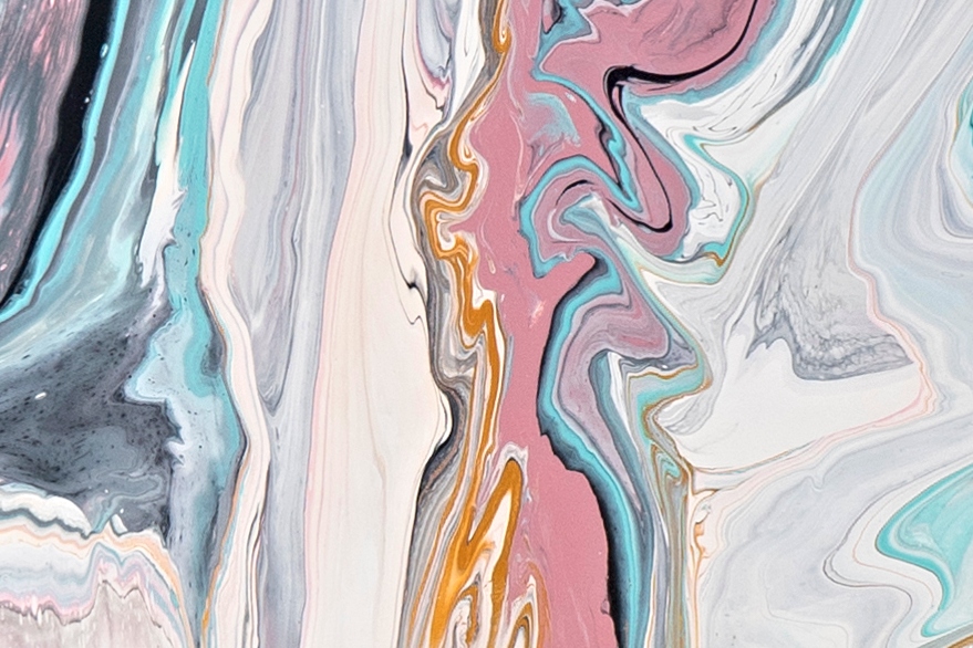
This painting was created using a few different cups of paint. As you can see one had peach, white, grey and gold. Another had turquois, dark blue, peach, light grey and gold added. @canvasincommon
Color theory in acrylic pouring: some must-know principles
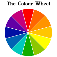
The color wheel
The most basic element of color theory is the color wheel.
You may remember from school that there are three primary colors: red, blue, and yellow.
The primary colors can be combined to create other colors, known as secondary colors.
Here is the color wheel again for your reference.

The secondary colors are:
- Red + blue = purple
- Blue + yellow = green
- Red + yellow = orange
It’s important to note that these combinations are in groups of two. If you were to mix red, yellow, and blue together, it would simply create brown.
This is where the muddy part of the muddy mix comes in. The three primary colors can be used together in the same piece, but you don’t want to use all three of them mixed on top of each other.
Lastly, If you combine the secondary colors with primary colors, you’ll reach the third level, known as tertiary colors.
Put simply: if colors are next to one another on the color wheel, you can combine them to create a new color.
If they’re on opposite sides, they won’t mix well.
Again, they may work well together separated in the same piece, but not by mixing with each other.
Hot tip: You can continue on to create all manner of different colors using a few simple paints, simply by combining them.
Warm vs. cool colors
Another important principle is warm and cool colors:
- Warm colors are orange, red, and yellow, those that feel “warm” and jump out at you.
- Cool colors are blue, green, and violet, more soothing colors.
Using varying amounts of warm and cool colors in contrast will add a sense of movement and focus to your work.

This piece has a satisfying mix of warm vs. cool colours. Image: @canvasincommon
The power of neutral colors
Neutral colors are often neglected because we feel inclined to just use bright, exciting colors. But a neutral palette actually helps to frame and provide contrast to really “show off” those bright beautiful hues.
Neutrals, such as white, black, beige, and gray work alongside any color on the wheel. I also find gold, silver and pale colors with lots of white added to them, also work well as neutrals in acrylic pouring.
Scroll down for some popular color combos to try!
Tints and shades
Tints and shades are an important part of acrylic pouring. If you just use straight primary colors out of the tube they don’t have much variation in your artwork.
This is why using white and black to create different tints and shades is effective in art.
White will lighten and make a colour paler which can make it more pastel in color, and appealing to look at especially when paired against a stronger pigmented hue.
Adding black paint will make a color a bit darker and more grey, which can be perfect for making a moodier color.
For example, adding white paint to violet will change the hue, creating a different tint depending on how much you add. You can experiment with colors by adding white or black to try and reach the hue you’re after.
Using borders in acrylic pouring
By adding paints to the surface separately, you can prevent them from bleeding into each other, by adding a border of white and/or black paint to separate the colors.
Earlier in this article we talked about having two different cups of paint colors and then pouring them separate to each other. For example in the painting below I used three different cups of paint. One which was dark pink, light pink, black, gold and white and one which was the same but with blues. The third cup had a mix of just whites and greys.
If you pour these cups separately you may want to add a border. Below you can see that I poured some black/grey/white borders to help these colors pop.
To do this you just always have a cup handy with just black and some grey and white paint in it too, you then carefully pour it out of the cup in a steady paced lined across the canvas! You can just pour straight black too for a really bold border. This skill can take some practice and confidence to achieve.
You can see some use of borders in this piece, the black/gold bordering the blue and pink colors to make them stand out.And the white/cream bordering the grey and blue colors. Image @canvasincommon
Color schemes which look great together
There are a few basic color schemes which tend to look great together:
- Complementary: This involves colors on opposite sides of the color wheel. When put side by side, they really stand out. Complementary colors are good for areas of your work where you want to draw the viewer’s attention.
- Analogous: These are colors close to one another on the color wheel. They appear harmonious, but can also look bland if there’s not enough contrast. Combining complementary and analogous colors is a key part of advanced art.
- Triadic: This method involves picking three evenly-spaced colors from around the wheel, forming a triangle. If successful, they will perfectly balance one another out. This notion can be expanded to include different types of triangles, or even squares of four colors.
- Monochromatic: Building around a single base color and employing different shades and hues is known as a monochromatic style. It’s important to make the tints different enough so they stand out from one another.
Sources for inspiration – detecting colors from another picture
When you want to move beyond basic colors and experiment with unique styles, it can sometimes be difficult to figure out what goes together.
A great method for learning is to find a piece of art you like from Google or social media, whether it be a painting, photograph, or another piece of acrylic art. You can visually attempt similar colors or use Canva’s color palette generator to learn what colors were used. This will help you in purchasing or mixing the right colors!
To do this simply study the picture you like, and identify the colors that were used. Then mimic those by mixing them up yourself. The beauty of acrylic pouring is that it is random! You can quite safely use similar colors that were used in another piece without plagiarising.
Make sure you put your own swing and personal style on it! Use your unique angle, apply your acrylic pouring techniques and you will come out with a piece that has been inspired by another, but not copied so you can be proud of it.
What is the best pouring medium to mix with acrylic paint?
Your choice of colors doesn’t just affect the visual balance of your piece: different colors have different densities, and the consistency of your mixture will affect how the colors interact with one another.
It’s important to choose a good pouring medium that will flow and dry in a way you like.
Some popular brands include:
You can experiment with different pouring mediums and find the one that works best for you.
A basic acrylic pouring recipe
A classic recipe I use is one part acrylic paint, two parts floetrol, and a ligiht dash of water to loosen it up.
I use student acrylics or house paint from the hardware store, Australian Floetrol and water.
You’ll find that as you try more complex mixes, you’ll develop a better eye for what works and what doesn’t. The best way to learn is by doing, so go ahead and get started!

Bec is holding Australian Floetrol her favourite choice for acrylic pouring. @canvasincommon
Enjoy the process, have fun! Show me your creations. If you guys reckon I should write an E-book with a comprehensive list of good color combos I recommend please let me know in the comments as I would love to write it! Let me know any questions or advice that you have to share in the comments. Love to hear from you.
Cheers, Bec :)!


Very informative much appreciated
Hey Robert, my name is Katie and I just purchased this course. Do you know how to get into the group?
Have you ever considered writing an e-book or guest authoring on other websites? I have a blog centered on the same subjects you discuss and would love to have you share some stories/information. I know my audience would appreciate your work. If you’re even remotely interested, feel free to shoot me an email.
Thank you a lot!
You answered so well all the questions I just had. Looking forward making my new paintings with your advice
I don’t understand how to layer them. You say not to mix together. Do you mean don’t layer the complimentary colors together. Can you please just give a few layering color recipes. Like describe a few colors to layer and then another set and say why
Hi Joy! Certainly, I am in the process of writing more thorough, comprehensive E-book. I will let you know once it is ready but in the meantime… Do not stir your cup once you have finished layering the different paint colors into it. It will mix up too much and yes the overall color can change in a bad way. It is best just to layer them in and then give it a little shake from side to side rather than a full on stir. And you are correct, try to avoid layering say red, then immediately say a green color. These two on top of each other may start to combine to make a brownish color. It is safer to keep those separate or put a neutral color in between. Hope that helps, let me know if you have any questions! Cheers for the comment 🙂 Bec.
This is a game changer. . thankyou so much. Im beginnig to understand how i can be successful with my outcomes and not waste time, paint and money! Thanks again. Regards Julie
Julie, your comment really made my day! I am so happy this is helping to clear up some of the confusion. I had the same questions as you and they are quite simple once you boil down to it. Thanks for reading and commenting. I hope that you start getting the outcomes you want. Practice, practice, practice. We are all always learning and improving. Enjoy! Bec 🙂
Thank you for this informative piece. I’m a beginner and this clears up so much for me.
Woohoo! That’s wicked to know. Thanks for reading and commenting. Happy pouring Kimberly! Any questions along the way just let me know.
Great information, I’m now dying to try this out. An e-book would be a great asset for me.
Hey Margaret, That’s great to hear thank you. I will start writing it. Would love to just dump everything I have learned in it, all the secrets in one place. Will keep you updated. Cheers, Bec.
I’m also a beginner, and have just picked up some paints and ingredients. I think I’ve been reading and watching videos for months!
I really like the blowing technique, but was concerned about blowing say, red into green, making that brown color. Lining the colors up with the neutral between them, will that prevent the muddying?
If you have an announcement list for your e-book, please add me to it!
Thanks for taking the time to share.
It is daunting to realize how much there is to learn. Thank you and all others for their tutorials. My goal is to someday be able to help others along the way.
Fantastic suggestions and advice. I have watched dozens of YouTube videos just to be left more frustrated and confused. Thank you for taking the time to share with us newbies!
Just returned to re-read your excellently written article I was glad to find a while back as it’s def very helpful! I especially appreciate the pics you included as I’m a visual learner plus with SO MANY different shades of colors out there it’s overwhelming (& frustrating, expensive, etc.) knowing which dark blue (for example) would look best with say, a light &/or teal green or payne’s grey (1 of my fav’s!). Hope you’re still considering making an e-book & if so-please include as many pics as possible lol! Thank you again!!! ~Heather
How do I keep my base paint from bleeding through in pick marks?
Hi – your article is fantastic! I’ve never learned so much in one place. I’d love to know when your ebook comes out so if there is a list please add me to it. Do you have a Facebook page?
Thanks again for all the great info. I can’t wait to put it into play!
Good to know!
Thank you for a very informative article! I’ve just started acrylic pouring and am totally addicted. Just wanted to know if there’s a way to create my own pouring medium. Where I live way out in the boondocks, we don’t have things like Floetrol and to import it is prohibitively expensive. Thanks again!
I wish I’d found this sooner. I’ve looked at many other sites and they all want to teach a full on course about colors. I get that there’s some learning to do, but I don’t want to spend all day reading things that wind up confusing me. I get nothing from that way of teaching. You made it so easy to understand by keeping it simple and direct. The included examples really helped a lot and your comments were on point. Thank you so much! My biggest hurdle right now is the Dutch Pour. I wind up with way too much paint and it all goes to mud. The only one that actually looked really good…well, it wasn’t level and when I realized it, the poor thing looked so darn sad, lol. I’ll keep at it & now that I’ve got some real color knowledge, thanks to you, I’m going to mix some paints for my next pour. Thanks again!
Wow, it is so nice to read this. Choosing the right colors is diffucult sometimes and having this definitely helps. I’ve been painting for almost a year and i love mixing my own colors, I am always looking for different color combos and am unsure whether they will work. Thank you for the knowledge!
So helpful for this newbie! Thank you!
This is just the type of information I was looking for. Thank you! I understand how colors combine, but you really made it all make sense. Whew! I’d love to see an ebook when you have it.